Comparative Analysis
For my comparative analysis, I researched photography portfolios to get layout inspiration. The first similarity that stood out to me was the inclusion of at least one large photograph on the website's home page, as I expected. While all of them had a logo near the top of the webpage, one of those was a bit more ambiguous and required looking at the tab heading and URL to see their name, or to click on another page. Based on my reaction to these, I plan to include my name on my interactive narrative to make my branding clear from the start.
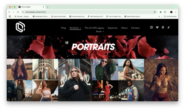
https://www.chriscollado.com/portfolio
As I scrolled through Chris Collado's portrait page, I found the banner a bit distracting as it's a video compared to the still images that comprise his portfolio. While I like the different sizes of images to create visual interest, I would prefer having a slight gap to separate the photos from one another.
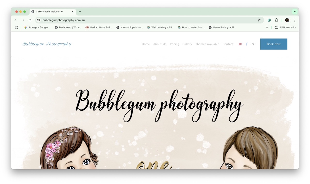
https://www.bubblegumphotography.com.au/
I found the home page of Bubblegum Photography to be visually cohesive, especially with the color palette. The large logo/illustration near the top of the page grabbed my attention before moving on and looking at the photos. While I think this works well for a business that is looking to gain clients, I would want my website to showcase my photography in a simpler way since I don't yet have a specific niche and will be job searching soon.
Other websites I discovered include:
DrewTheFotographer
J Julian De Rise Photography
Based on my research, I plan to have a minimalistic homepage that links to more in-depth sections, which will have more photos and artist statements.